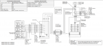
Unrelated issue first: your fusible disconnect, isn't drawn as a fusible disconnect. I see the fuses, but no blades. The open blade points toward the energy source that it doesn't shut off (i.e. away from the inverter), so that the blade and fuses de-energize in the open position. I recommend drawing this so the open blade points upward, so it reflects the orientation in reality. It should be clear which orientation to wire your disconnects, especially those that require another utility shutdown to correct ex-post-facto.
Only thing I can see, is that the diagram showing the generator neutral solidly tied in to the neutral of the service is throwing them off. Possibly someone who is seeing the term "transfer switch" for the first time, and doesn't care to look up the term. Obviously, that's the way you have to wire this particular generator, so it's not like you can show it any other way if you have to show it in three line form. Perhaps drawing the neutral as gray would help make these connections a lot less vivid, and stand out a lot less to the person reading the drawing. I'd also recommend filling in the words "normal" and "alternate" on the transfer switch, so they can see the two positions.
I'm generally in favor of single lines, as opposed to three lines. For the transfer switch specifically, its purpose is clearer to me on a single line. Less labor to draw, less labor to change, and less drawing elements to distract you from the essential information. I'm aware that the three line may be required by policy that isn't up to you, but if the choice were mine to make, I'd recommend single lines. Some parts of an electrical line drawing might be best communicated in a multiline detail view, but for the overall schematic, I recommend the single line drawing. Examples: phase staggering of 2-pole breakers on a 3-phase panel, details for connecting both DC polarities to a switch, wiring DC through multiple poles of a switch per MFR's requirements, relay instrumentation.